Microsoft has invested in supporting documentation and materials to assist end users in the adaption of Power Bi. One of the best ways to get a fast start on Power Bi is to register for Dashboard in a Day.
What is Dashboard in a day?
Dashboard in a day is a one-day, hands-on workshop for business analysts that covers capabilities and features of Power BI. The shop walks users through all the steps of data importing, shaping, modelling from a variety of sources. Then you will go through creating views and analyzing data for insights to understand the ‘story’ that the data tells. From there, you will build some stunning reports with Power BI and then publish these reports for distribution. Finally, you will learn how to build and share dashboards with your team and business partners on the web.
New users will be drinking in information from a fire hose. The course is still worth a look from more experienced users as these labs are full of tips and techniques, some you may not have seen before. I personally really appreciated how grouping data can clean up a Tree map by reducing the number of dimensions to slice in the view. Also, the lab on building dashboards and creating views from Q&A included phrasing a question to include the view you wanted (which I did not realize was an option).
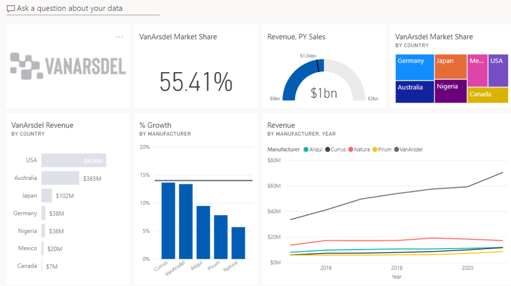
The dashboard I embedded is from the March shop and is a sales and market share analysis for a Chief Marketing Officer (CM0). A CMO has a focus on not just a company’s internal performance, but how well the company does against competing products.
The company, VanArdsel, manufactures expensive retail products for fun and work for a global market.
You will build a Power BI report and dashboard to support the CMO by providing analysis of market performance.

Course Materials
You can download all course materials including instructor slides from powerbi.microsoft.com/en-us/diad/.
Lab 0 – Prerequisites and Document Structure
Prerequisite software and registration required to take the shop. Also summary information on the project.
Lab 1 – Accessing and Preparing data.
This section walks you through using power query to import, clean up data, transform data and model data for your analysis. To make the analysis interesting, the data has to be pulled from multiple locations, folders and documents.
Lab 2 – Data Modelling and Exploration
This section has 202 steps and literally walks you through ad hoc analysis and techniques that will help you better understand the data and determine key points you will want to emphasis in your analysis. You will create and transform views multiple times to see the data from different angles. I found this section the most helpful for me as this kind of analysis from other experts is fantastic for improving my own game when exploring data.
Lab 3 – Data Visualization
This section will walk you through the creation of a Manufacturer Analysis report. Of interest to me in this section is the use of focus and filtering to emphasis key KPI performance that is then bookmarked and can be accessed through the bookmark navigator. This kind of preparation would be very helpful when walking through the data in a presentation.
Lab 4 – Publishing and Accessing Reports
This section skipped ahead an entire second page in the final report. The final report from each section is available if you have issues. Simply start with the previous chapter’s report. That what I ended up doing for this section. I assume that steps were taken out so that the shop fit the time constraints of DIAD.
This section will walk you through creating a mobile view, publishing your report and building a dashboard.
Lab 5- Collaboration
This section will be a lot of fun if you’re new to Power BI as you are walked through creating an app that you can use for distribution of your report and dashboard. Users will be able to view your dashboard and report on both their computers and their phones.
Criticism
Skipping over the creation of an entire report and forcing the student to abandon their project for a provided final report is disappointing for anyone who wants to take their project from conception to distribution.
If you don’t take out time to review the Market Analysis report that was provided for you to publish (and not created by you), then it’s likely you’ll miss the time animated Revenue and % Growth view. Both filtering for Australia and Focus mode on this view will give you a great visual for a presentation. You can use this view to present to users how the increase in Extreme product sales from 2018-2021 drove the market share growth in Australia. So, I’m just disappointed the lab section that explained how to use the customer ‘Play axis’ view was used to build this view.
Conclusion
Microsoft has done a terrific job with the Dashboard in a Day series. The one-day shop is full of useful information for beginners and experienced Power Bi analysts, alike. I highly recommend getting downloading the materials for this course while it’s available and registering for the next shop.