Summary
For my first Power Bi blog I decided to test a report formatted to fit into a blog layout. There are multiple features to configure and test as I integrate the dashboard into the website. I’ll begin with describing the purpose of the report, what it features, and how to use. I’ll then go into how the data was pulled, tested, and shaped. Next, I’ll discuss my decisions on the visuals selected. Finally, I’ll discuss publication and any challenges encountered.
The Purpose
This Power BI report provides a summary and insight into the financial performance of Adventure Works in 2012. Adventure Works is a practice dataset provided by Microsoft for students. I’m using the financial dimension and fact tables in AdventureWorksWD2017 for this report. This report is a test example that I will publish publicly into a WordPress blogsite.
Features
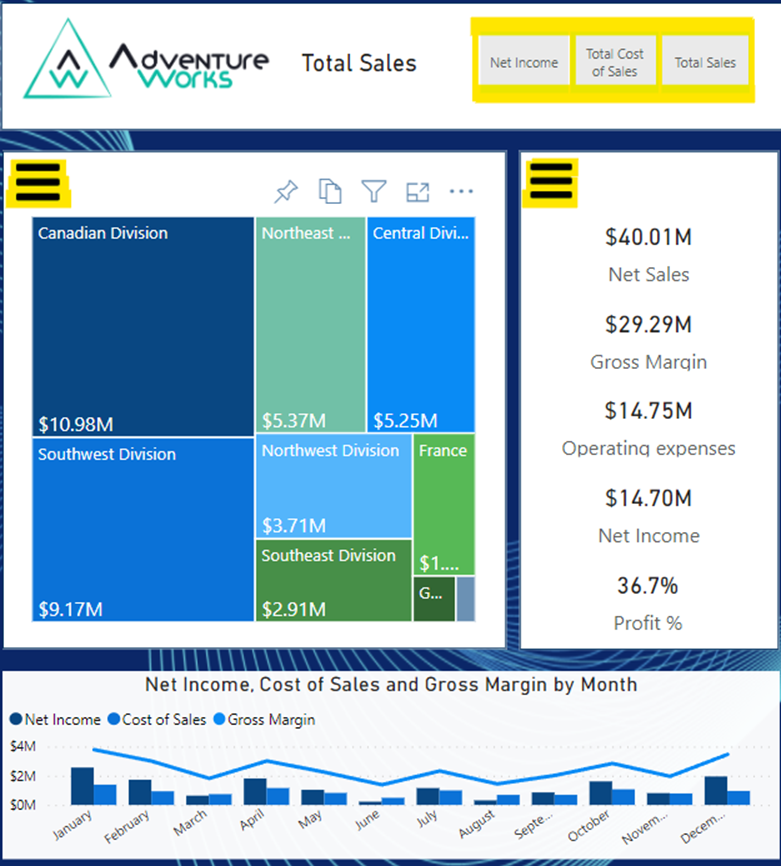
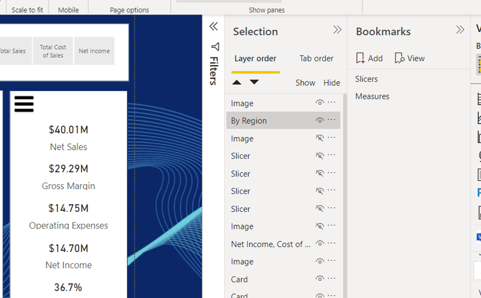
The Adventure Works Financial Report provides summary financial data on operations activities by region. The relatively simple layout provides a view of Net Income by region. Cards are used to show net sales, gross margin, operating expenses, net income, and percent profits. A tree map graphic shows relative size to region of sales, cost of sales, and net income. The tree map can be easily filtered by selecting a box to update the cards for a single region. The Second visual is a line and clustered column chart that shows net income, cost of sales and gross margin by Month. The second visual can be filtered by selecting a month to update the cards. There are three buttons in the top right that can change the numbers in the tree map from total sales, to cost of sales, to net income.
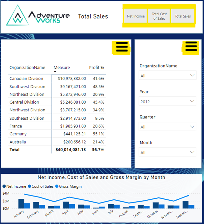
The user has a second view of the data they can switch to. There are two ‘hamburger’ buttons that can switch the tree map and cards view to a table and filter view of the data. The table can be updated with the filters or the line and clustered column visual.
*If you want to filter by both division AND month, hold down the ctrl button as you make your selection!
The selection of visuals and filters makes a very pleasant mobile view to look and to interact with.
Pulling, testing, and shaping the data
Pulling and testing
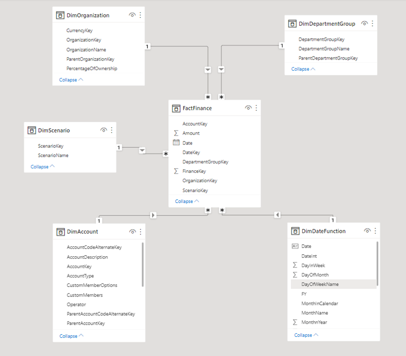
AdventureWorksDW2017 has over thirty tables to work with including six dimension and one fact table for financials in a snowflake layout. Data is loaded on the tables monthly. Unfortunately, the data was inconsistent in 2010-2011 and missing December in 2014 meaning there are only two viable years to do year over year comparisons. The total operation balances for each month is loaded, and the balance sheet balances at end of month are loaded. There is a table called DimScenario which has a simple means of splitting data between actual, budget and forecast. Unfortunately, this data is mostly missing and no actual versus budget is possible. There is a regional dimensionality, but unfortunately no department dimensionality. Any view I create from this data will have dimensionality limited to 2012-2013 and by region.
I downloaded and installed the tables to SQL server 2017 on my home computer, reviewed the tables first in Microsoft SQL Server Management Studio and then used an enterprise gateway to import the data to my workspace in Power BI.
Shaping
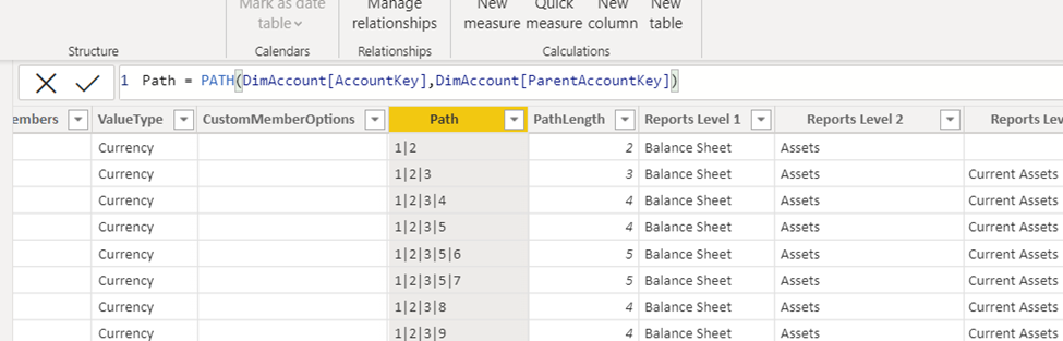
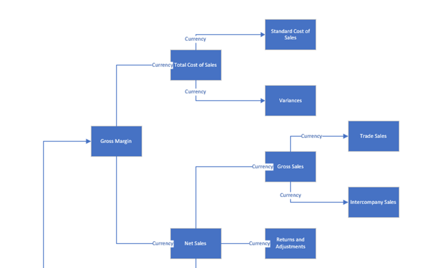
Dimensional table DimAccount contains parent-child relationships between accounts as well as an operator field that can be used with logic for posting balances the correct direction between assets, liabilities, income, and expenses. I used DAX path functions to add columns to the table so that I could build a view with an income statement or balance sheet view. I also imported the table into Visio and built a chart of accounts so that I could review the accounts used to track Wonder Works business activities.
After reviewing the DimDate table I decided to replace that table with my own date table as I believed I would have more options to perform time analysis.
Building visuals
Constraint
The first constraint I had on this report is the layout must conform to WordPress formatting. After testing I determined the dashboard had a constraint on width to 650 pixels to fit properly in a post. I set canvas settings to a custom 720 height and 650 width.
Measures
I added DAX measures to the workbook for Net Sales, Cost of Sales, Gross Margin, Operating Expenses, Net Income, and Profit %.
I wanted to create dynamic measures in this dashboard so that the user could filter data by total sales, cost of sales, and net income. To do this, I first created a new table called Metrics by selecting ‘Enter Data.’ The Table has two columns. In the first column called Measures I added “Total Sales”, Total Cost of Sales”, and “Net Income.” The second columns is an index to ensure the first column is presented in the correct order. I then created a new DAX measure called Measure Selected using SELECTEDVALUE pointed to table Metrics. Finally, a second measure uses SWITCH and Measure Selected to determine if measure ‘Net Sales’, measure ‘Cost of Sales’, or measure ‘Gross Margin’ is used in a view. I then created a Slicer that points to table Metrics and changed the slicer settings orientation to horizontal to create buttons. Any views that would change dynamically would use measure logic in ‘Values.’
Views
I tried to build a matrix view of net income by region but found the space required and impact to be unattractive in the report. I also tested creating a balance sheet view but due to space constraints and other factors I decided I would save that view for future reports built off this dataset. This report would focus on operations financial performance only.
So, I opted instead to present summary income numbers using cards supported by a tree map of regions and a monthly table. I described already the second view I created using a ‘hamburger’ button. To build the second view, I created two bookmark views and hid the graphics for measures in bookmark ‘slicers’ and the graphics for slicers in bookmark ‘measures’.
Tooltip
I debated setting up a second page to create a tooltip view of Total Sales, Cost of Sales, and Net Income with sparklines, but decided it would simply clutter up the report as this information is visible in the cards and table by simply slicing.
Finally, I switched to the mobile layout and assembled a mobile view of the same information.
Theme
I wanted a bright colour palette with a rich page background for this view and I think the ‘Tidal’ theme fit the bill perfectly.
Publishing and Posting to the blog
I published the report to my workplace in Power Bi. Then, the real fun begins!
I want to post this workbook into blog, and I want to have several buttons outside the iframe in the blog interact with the report view.
Embed in a public website
To embed in a public website, you will need a Power BI Pro or Power BI Premium licence with Microsoft. Microsoft offers a tree trial for premium and licencing begins at $10 per month for a single user.
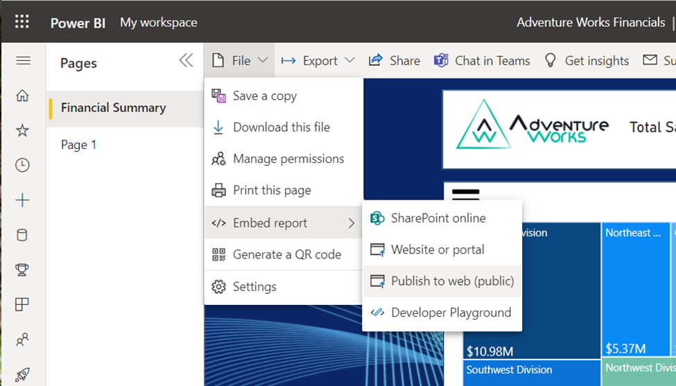
In the Power BI browser select File>Embed Report>Publish to web (public).
Several alert screens will pop up before you get a ‘Success’ screen with link for sending a report by email or embedding in HTML. Note, you will have to get your admin to grant you permission to publish a report publicly. If you own an E3 license, you can grant yourself the Power BI administrator role inside the Azure Admin panel and then you can enable external publishing.
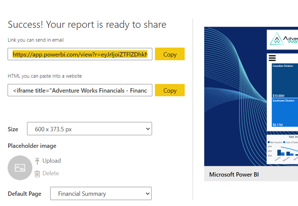
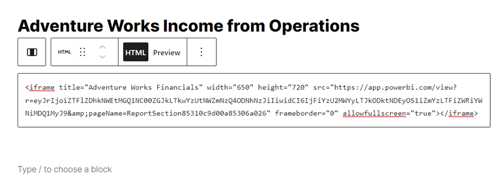
You’ll note that the iframe size is 600 x 373.5 px and we’ll need to adjust the width and height to 720 x 650 px. Here’s the full script:
<iframe title=”Adventure Works Financials” width=”600″ height=”373.5″ src=”https://app.powerbi.com/view?r=eyJrIjoiZTFlZDhkNWEtMGQ1NC00ZGJkLTkwYzUtNWZmNzQ4ODNhNzJiIiwidCI6IjFiYzU2MWYyLTJkODktNDEyOS1iZmYzLTFiZWRiYWNiMDQ1MyJ9&pageName=ReportSection85310c9d00a85306a026″ frameborder=”0″ allowFullScreen=”true”></iframe>
So I changed the first link to width=”650″ height=”720.”
Posting in WordPress Blog
What I like about posting blogs in WordPress is the block layout in the post editor. I can simply change a block to ‘HTML’ and then paste in the script and the iframe now has a place in the blog. You can setup tables to frame data- all sorts of stuff is possible.
Buttons
My final stretch goal for this blog is to add buttons inside the blog that will interact inside the iframe to filter and change the view. For this purpose, I downloaded and installed Simple Custom CSS and JS and followed the directions provided by Microsoft. You can review the documentation here: Embed a report in a secure portal or website – Power BI | Microsoft Docs.
I modified the sample code to filter off table‘Metrics’. I published the JavaScript to the page header.
Unfortunately, my testing failed, so will leave this interactivity out of this post. I’ll revisit this again with a simple report with a single view to nail down the syntax required.
Conclusion
In conclusion, this is how I built a financial view of Operations Income and published it publicly into a WordPress blog. I have the dashboard also presented in the portfolio section of this blog. My focus from here is to find ways to increase the interactivity for the user. I have tested buttons that can filter the view inside the iframe on the webpage. I will also be added bots to these pages and explore how to provide support to get the user to adapt these new reports.
*You can check out the report in my Portfolio by clicking Compact – Add Power BI.
**Feel free to reach out if you have any questions, queries, or would like to hire my services!